Red flags for customers: What visual to avoid in your marketing communication
Learn new ways to reach your customers and establish communication that builds loyalty, trust, and community around your brand.

Millennials and Generation Z — the most active online buyers — often change their visual and shopping behavior. They monitor cultural and political events and set visual trends in motion by forming influential micro-communities based on interests and values (more on this, see Creative Trends 2024). As a result, the only way to satisfy their needs and gain appreciation is to be flexible and up-to-date.
In this article, the Depositphotos team will take a look at things from a different perspective and analyze which visual concepts are no longer valid in marketing communication. Check to see if any of them are preventing you from reaching young customers.
How have audiences changed this year?
Why do clients like some designs, but don’t like other ones? This could be because these designs don’t reflect their values or the way they see the world, are not authentic enough or copy something already existing, or are simply something considered “of bad taste” in their community.
The good news is that you can study user preferences using social listening tools and invest more resources in creative experiments and tests. However, there are also general (global) tendencies that can help you produce more content clients will positively react to. The topics and concepts that are dominating communication today are:
Ethical consumption
Millennials and Gen Zs are concerned about the environmental impact of their choices, and they are more likely to opt for brands that declare a lower environmental footprint and apply ethical production practices.
Tech and AI
Technologies can save time and costs, but what’s even more important, they can improve the quality of life of buyers. Understanding this, they often react better to content that highlights that a company is taking advantage of the latest technologies. Learn more about how to improve business performance with generative tools: 5 non-obvious ways to use an AI image generator for marketing.
Feeling of belonging
Community building is essential to forming a pool of loyal customers. In practice, this means that brands should offer clients more than just a high-quality service or product. They should support an environment users can be proud to enter.
Focus on health
A healthy lifestyle is one of the top values for younger generations. In turn, brands can show how they care about shoppers’ health by providing them with no-stress services or offering products for better mental and physical health.
Authenticity and privacy
Trust is always a pivotal aspect in brand communication—clients don’t buy from those they don’t trust. Tech advancements have taken trust issues to another level. Today, clients expect online brands to share behind-the-curtain views of their production and take extra care of data.
As in previous years, the best way to gain attention and trust from your audience is to approach them personally. Note that although personalization means tailoring visuals to a client’s taste, consistency in communication is essential for keeping your brand recognizable.
10 “red flags” for your customers: Images, composition, and editing style to avoid this year
1. Cultural insensitivity
Cultural and context awareness will help you avoid tone-deaf visuals. Most AI-powered generator engines produce images without understanding their possible discriminative nature. On the other hand, you can try the AI Image Generator by Depositphotos, which is trained to follow common ethical principles.

2. Stark minimalism
Minimalistic visuals add room to breathe in your design and have a general soothing effect. At the same time, it’s tough to make minimalistic compositions intriguing and directly linked to your distinctive brand style. Explore which styles you can use instead of minimalism in another article by Depositphotos— Leveraging 2024 trends: How to minimize risks when experimenting with booming aesthetics styles.

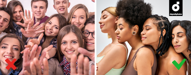
3. Homogeneous human group
Lack of inclusivity is a mistake brands can easily make if they come from local markets and are used to communicating with audiences of lower diversity levels. To connect with international and national campaigns, choose images where people of various races, ages, and body types are represented.
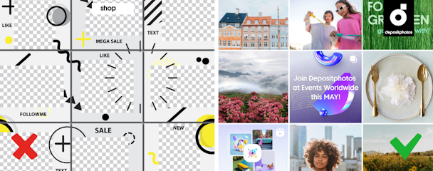
4. Seamless feed on Instagram
This trick appeared over five years ago as an alternative to non-consistent, cluttered brand feeds. The idea was to help first-time visitors understand a brand’s Instagram style, vibe, and values and see its best items. Unfortunately, this concept prevents brand accounts from publishing diverse content and being flexible.
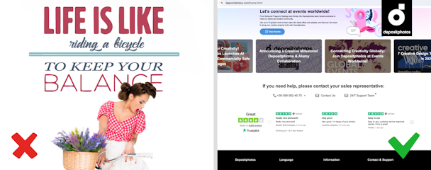
5. Highlighted quotes
Indeed, client testimonials, references, and famous expert recommendations are a must on your website. At the same time, abstract motivational quotes and phrases from fictional literature don't work on social media, in articles, or on your website—they look too similar to references and confuse users.
6. Symbols and popular visual metaphors
You can do without arrows, flashes, bubbles, lamps, and other popular symbols outside your website navigation. Avoid them in poster design, except while purposefully using a “cliche” aesthetic. Look for fresh ways to translate your message into visuals in posters, hero images, and banners. Allow recent photography and graphic design trends to help you.

7. Flat-lay shooting
Although this approach helps present a set of products or create a sense of well-organized space, it has been overused in recent years on social media. In 2024, users are blind to flat-lays and don’t see them as an authentic and creative way to showcase products. Try compositions shot almost from the ground—this trick adds depth and layers to your image.

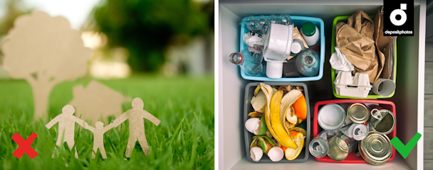
8. Green and rainbow-washing-like visuals
Brown textured paper and the color green are not the only attributes that can help brands highlight their responsible attitude toward natural resources. The same goes for the LGBTQ+ rainbow.
Use any grounded colors to highlight your commitment to sustainability. But more importantly, share your brand stance explicitly and describe how you actually support your sustainability goal. Regarding LGBTQ+, focus on personalities and equality in your messages. Here are some examples of trending and non-stereotypical visuals you may use.
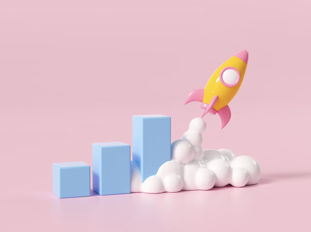
9. Static 3D graphics
What once looked outstanding and therefore appealing soon becomes overused and boring. A bright example is 3D character graphics that dominated blogs, website designs, and promo animation from 2020 to 2023. Today, “plasticine”-like 3D heroes don't look original, and it’s better to substitute them with live-shot photos or realistic AI-generated graphics.

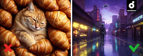
10. “AI-generated” core
Generative AI can create much more than visuals that look like they were taken from a computer game from the previous decade. Modern tools enable you to play with artistic styles—from Hyperrealism to Pop Art similar to Andy Warhol’s textile prints. Go beyond creating fantasy worlds, mixed realities, and funny unrealistic compositions to find a style that matches your brand’s philosophy.
Updating your visual communication. What should you remember?
Visual trends and your client's preferences are constantly changing, which is why it’s critical to not build your entire branding around trends. Instead, if you feel your communication craves updates, start by defining what you will not change, including your brand values and core messages.
Analyze your audience and the ideas dominating their world, and think of what you can add to your visual storytelling to align with them more. Finally, get rid of outdated styles and visual elements and substitute them with thoughtfully chosen trending attributes. And remember: To make any visual experiments budget-friendly and easy to conduct, you can use stock content.